Christopher Grant has led UX teams for over a decade. Today he is User Experience Director for King, the makers of Candy Crush, where his team engages a network spanning hundreds of millions of players across the globe. Previously, he led key strategic projects at innovative startups like Tuenti, Sclipo and Emagister.
When not working, he mentors at Google’s Launchpad program where he helps the next generation of startups in Barcelona and teaches User Experience Strategy and Management at KSchool, Universitat Pompeu Fabra and ESADE.
I remember the first time I heard the term “UX”: it was at the 2007 edition of Adaptive Path’s UX Week in Washington DC. When I returned to Barcelona a week later, I was energized by what I had learned and determined to make the “user’s experience” our highest priority. We would reinvent our products, improve our KPIs and even improve our users’ lives! The revolution had begun!
Sadly, my ambitions had little real impact. Don’t get me wrong, our company had always strived to make our site usable and worked hard on our “web design”, pushing ourselves to make it distinctive and cool. But our efforts had always started with our point of view and our business goal, not the user’s experience. This new UX focus would mean starting with the user and it would go deeper and wider than just web design. Although I fought hard to create a new UX role that would change the way we made product, my idea was rejected and no dedicated UX role was created.
Today, things are very different: just 8 years later, user experience is everywhere. It’s on the lips of CEOs, it’s the core value of the top design firms, it’s a crucial part of any digital designers toolbox and yet, I can’t help but ask: has there been a real UX revolution here in Spain? Or, like so many other fads, are companies and designers just riding the latest wave?
What is UX?
It’s amazing how many people use the term UX but can’t actually define it. Many revert to the “I know it when you see it” test the US supreme court once used for pornography or quickly mention the iPhone. Personally, I use this definition from Paul Fu, UX Director for Alibaba:
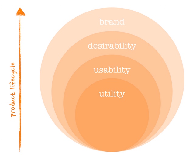
It consists of four layers. The core is what we call “utility.” Meaning, you have to fulfill certain core user needs. But that’s not enough. We also have “usability,” meaning can a new user learn about your product very quickly and can an experienced user do it efficiently? Then we have “desirability,” which is the look and the feel of the site, so people actually use it and return to use it again. Another layer is “brand experience,” which is utility, usability, and desirability forming the overall brand experience, to create loyalty.
This definition is thorough but, since its paragraph format isn’t very usable, I use this visual representation in my design classes:
I like this definition for a number of reasons:
- It’s author isn’t an academic or an idealist, he leads UX for an e-commerce powerhouse, so he knows the relative importance of UX compared to other key factors like price, fulfillment, site performance, etc.
- It understands that utility or “user demand” must come first and should be confirmed before investing in a product. Utility is a powerful motivator, the world is filled with useful products with complicated interfaces that users suffer through because the perceived utility is high enough.
- The building block structure reveals an important truth about products: UX follows a product lifecycle and, no matter how tempting, you can’t skip a step. Many of us have used a sexy product that just oozes desirability but, when we discover there’s no clear utility and/or poor usability, we stop using it.
- One final note about desirability, it’s not just about sexy. It can be anything from speed to the feeling of control that makes a user want to use a product, instead of a competing product or any similar alternative. A good, everyday offline example would be self-checkout at a grocery store. Many shoppers still prefer the longer waits to being “forced” to use a machine they don’t understand.
UX in Spain
Many digital products designed and built in Spain hit the first two parts of Paul Fu’s definition, but stop at desirability’s door. Why? Though it’s hard to generalize, experience tells me that market and investor pressure often force companies to prioritize short-term goals like conversion optimization competitive pricing over going deeper in their UX.
In other cases, products have reached desirability on web, only to be caught flat-footed by the mobile revolution. These companies don’t understand that what’s useful, usable and desirable on web isn’t exactly the same. They seem incapable of realizing how disruptive this mobile is thanks to its new ergonomics, contexts and user needs.
One positive example from Spain’s UX scene is Fotocasa’s “radar” feature. Rather than taking the easy road of “exporting” their web product to mobile, Fotocasa has taken the time to really understand how and what we use a phone for when searching for housing.
While Fotocasa may be the exception among companies transitioning from web to mobile, the mobile disruption has produced a number of smart, mobile-only startups. Many get the importance of UX from day 1, especially for real world mobile use cases.
Again, it’s dangerous to generalize, but perhaps mobile startups “get UX” because they were founded at a time when “experience” had already become an important part of the product conversation. Or maybe it’s just the power of the stars on every app store listing. Ratings mean that UX was finally, easily quantified and surfaced for all the world to see. I can’t help but wonder about the power of public ratings and what life would be like in a parallel universe where Google had used user reviews and not SEO tricks to rank search results!
Barbarians at the gate
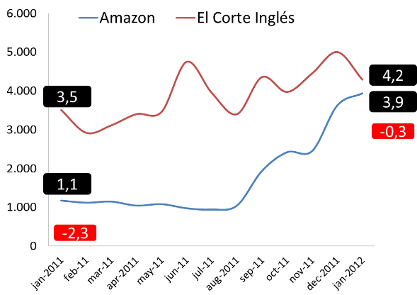
It’s a good thing that mobile startups and other smart Spanish companies are getting their act together, because their savvy international competitors have been investing heavily in UX for some time. The most obvious example is Amazon.es vs. El Corte Ingles (I’d also include FNAC though it’s not strictly Spanish). Until recently, ECI has invested little in eCommerce, with horribly useless search results and a painful buy online process.
While the Spanish giant slept, online native Amazon launched in Spain, grew its audience quickly and eventually became Spain’s leading ecommerce site.
Although the situation looks grim for big Spanish retailers, at least they can hide behind the entry barrier of local logistics. But what about Spanish companies that compete in the purely digital companies like Kayak or Booking? These foreign companies invested early in a strong UX because they understood a fundamental truth about the digital space: heavy UX investment creates a kind of “digital economy of scale” that works across markets. Eventually, as companies move from beyond “usable” products, they are able to grow in new markets. New markets mean new resources to invest in even more “desirable” UX that further outpaces their rivals. It’s a design-powered virtuous circle smart companies are already experiencing.
The future has already begun
Although change might not be visible in most products yet, its precursors are all around us. We now have two annual Spanish-language UX conferences.
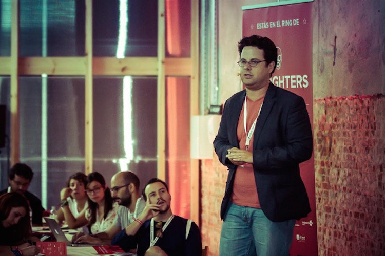
The author speaking at the 2014 edition of UX Fighters in Madrid.
KSchool and the UPF-IDEC both teach master’s level courses in UX and interaction design. Google Launchpad’s week-long boot camp includes a full day of UX mentoring for participating startups and UX-first startups like Typeform are growing fast. And perhaps the strongest indicator is the high level of demand for experienced UX professionals, despite Spain’s overall sluggish economy. Companies continue to poach talent from one another and repeated contacts from “UX headhunters” are familiar to most Barcelona and Madrid-based designers.
It’s only a matter of time before the work of these designers reaches the “users” of existing products or today’s garage startup, born in a new ux-centric world, becomes the next must-have product in Spain. And when it does finally happen, it won’t just be the users and designers who benefit.
Sales and conversion will improve and this growth will provide resources to further improve the experience. Everyone will win and the UX role in Spain will get the attention it receives abroad and, more importantly, the credit it deserves.


